mb Support
Stable at the core. Open for the future.
From umbrella brand to platform brand: how software expertise becomes the brand of a stabiliser – with a clear brand architecture, a calm voice and imagery that makes complexity visible.
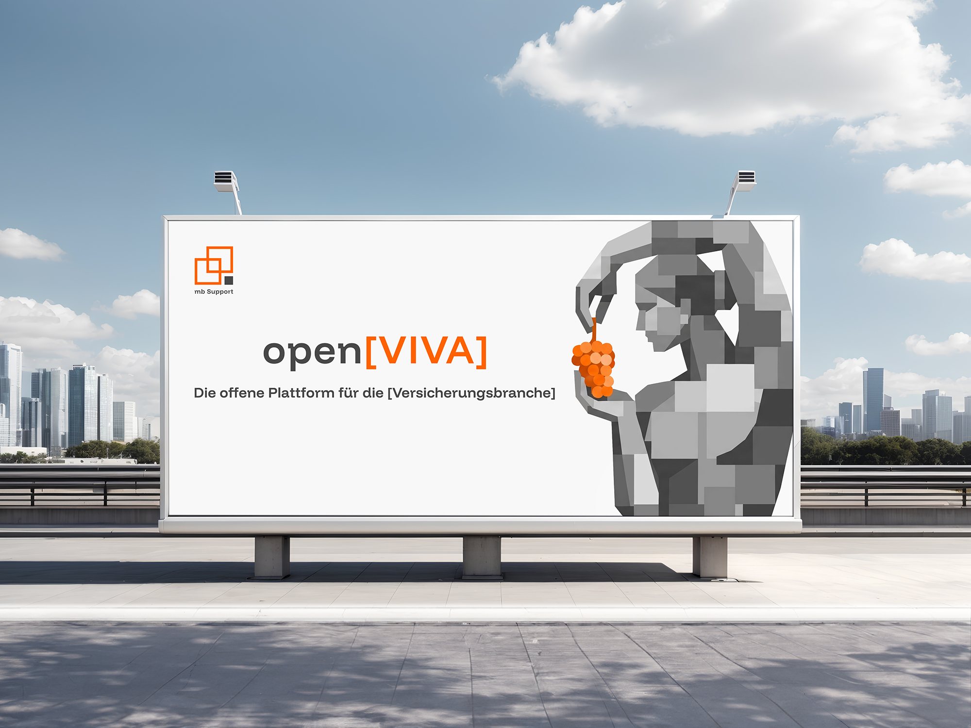
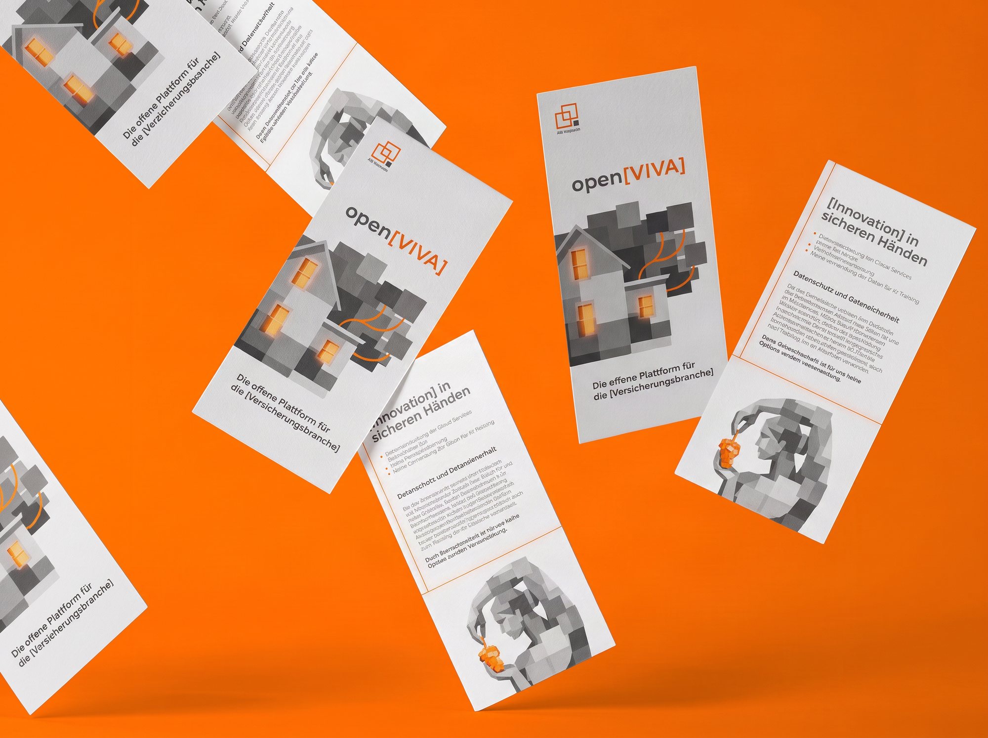

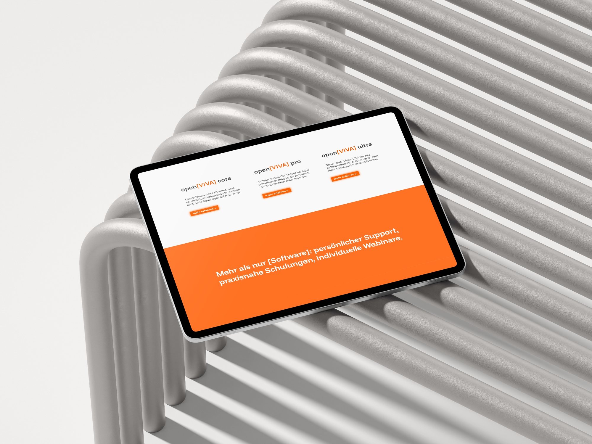
mb Support develops software for the insurance industry – systems that have to run reliably even under pressure to change. With open[VIVA], an open platform emerged that is more than a single piece of software. The brand had to live up to that role: clearly order umbrella and product brand, convey reliability credibly and make complexity understandable – without getting loud.
Reliability as the brand core
At the centre is the brand core “reliability”. It is not created by promises, but by responsibility taken, professional expertise and partnership-based action. From it we developed the positioning: We are the stabiliser of complex insurance systems and the reliable partner behind them.
The guiding idea “Stable at the core. Open for the future.” connects both brands: mb Support stands for stability and reliability, open[VIVA] for openness, modularity and future viability.
Umbrella brand. Product brand. Packages.
mb Support is the umbrella brand for open[VIVA], further products and product-related extensions as well as corporate formats. The symbol of two interlocking frames stands for systems that are connected and kept stable. The square brackets in the open[VIVA] logo stand for openness, extensibility and the modular platform principle.
Packages such as open[VIVA] core, pro and ultra, as well as extensions and formats like mb Crew or mb Live, get no logos of their own. They are derived typographically from the existing system – so the brand stays clear and consistent as it grows.
Making complexity visible. Conveying stability.
Modular, geometric elements symbolise the diversity of interconnected systems. The complex world of systems recedes into neutral greys, while orange marks what stabilises, connects and orients. A clear motif system – from crane to house to sculpture – can be continued for every line of insurance.

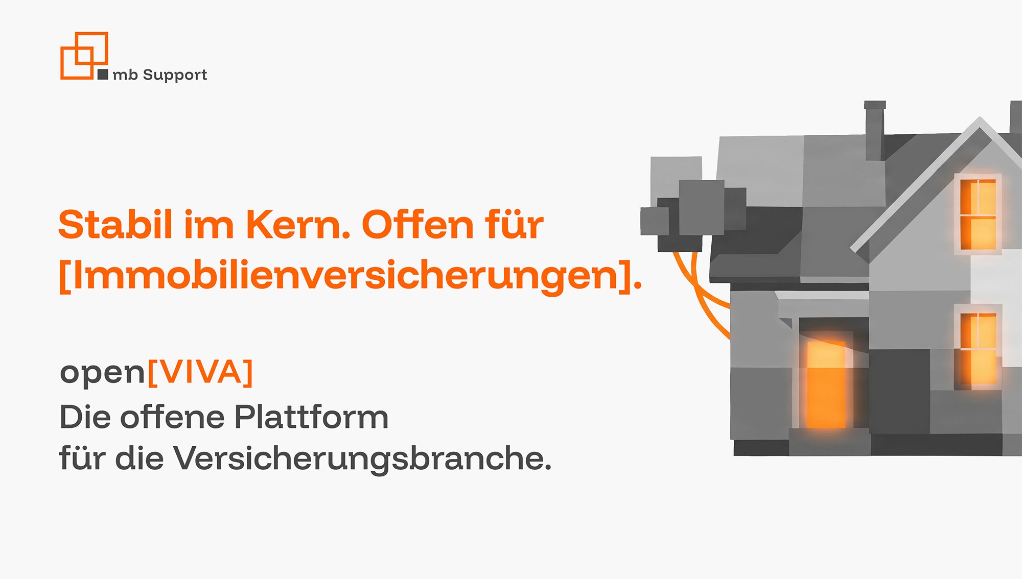
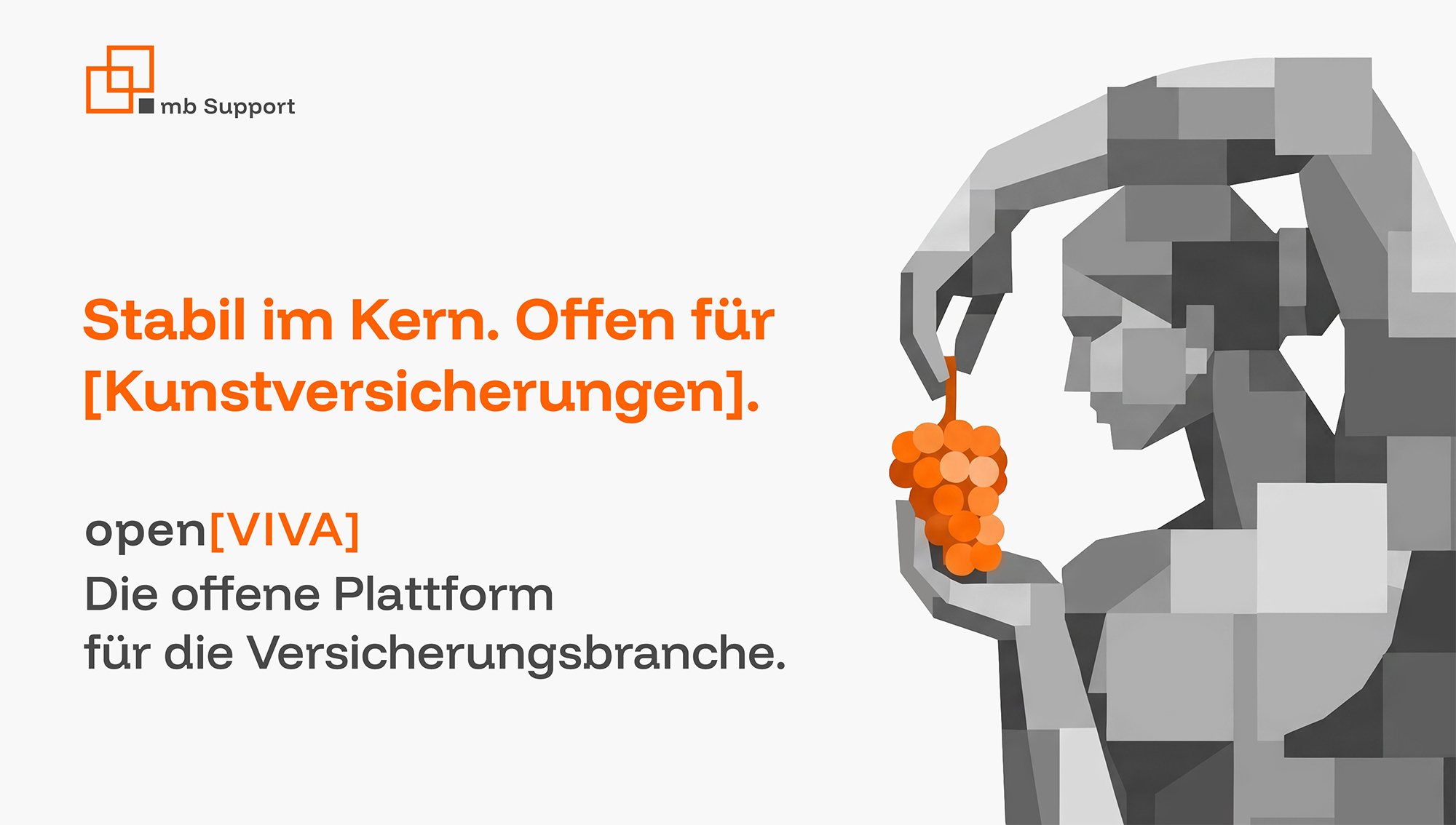
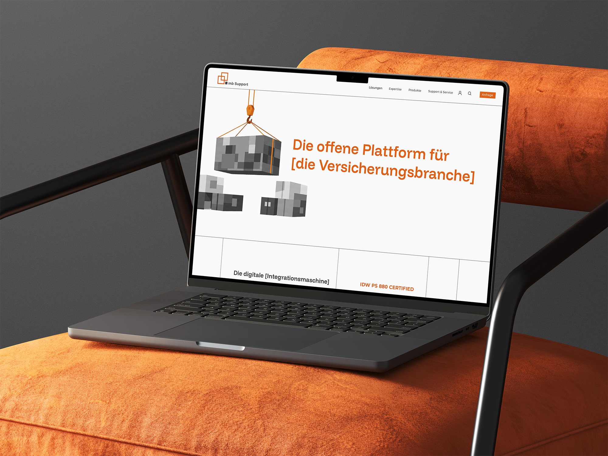

The result is a brand system that makes stability visible and tangible: an umbrella brand with a clear role, an open product brand and a distinct visual world. Funnel Display and Montserrat, a reduced colour concept of orange and grey, an emphasised grid and glowing accents ensure recognition. A mini style guide makes the system applicable – from posters to print and social media to the website. mb Support thus becomes a stabiliser that also visually delivers what it promises.
Stability does not come from volume.
In complex systems, it is not a loud brand that convinces, but a clear one. A calm voice, neutral surfaces and a stable grid create orientation – and orange sets accents only where it has the most important job.