VIVI Sleep
Rest. Recharge. Redefine Performance.
From idea to a distinct brand: positioning, naming, corporate and product design for sleep pods that bring regeneration to where performance happens.

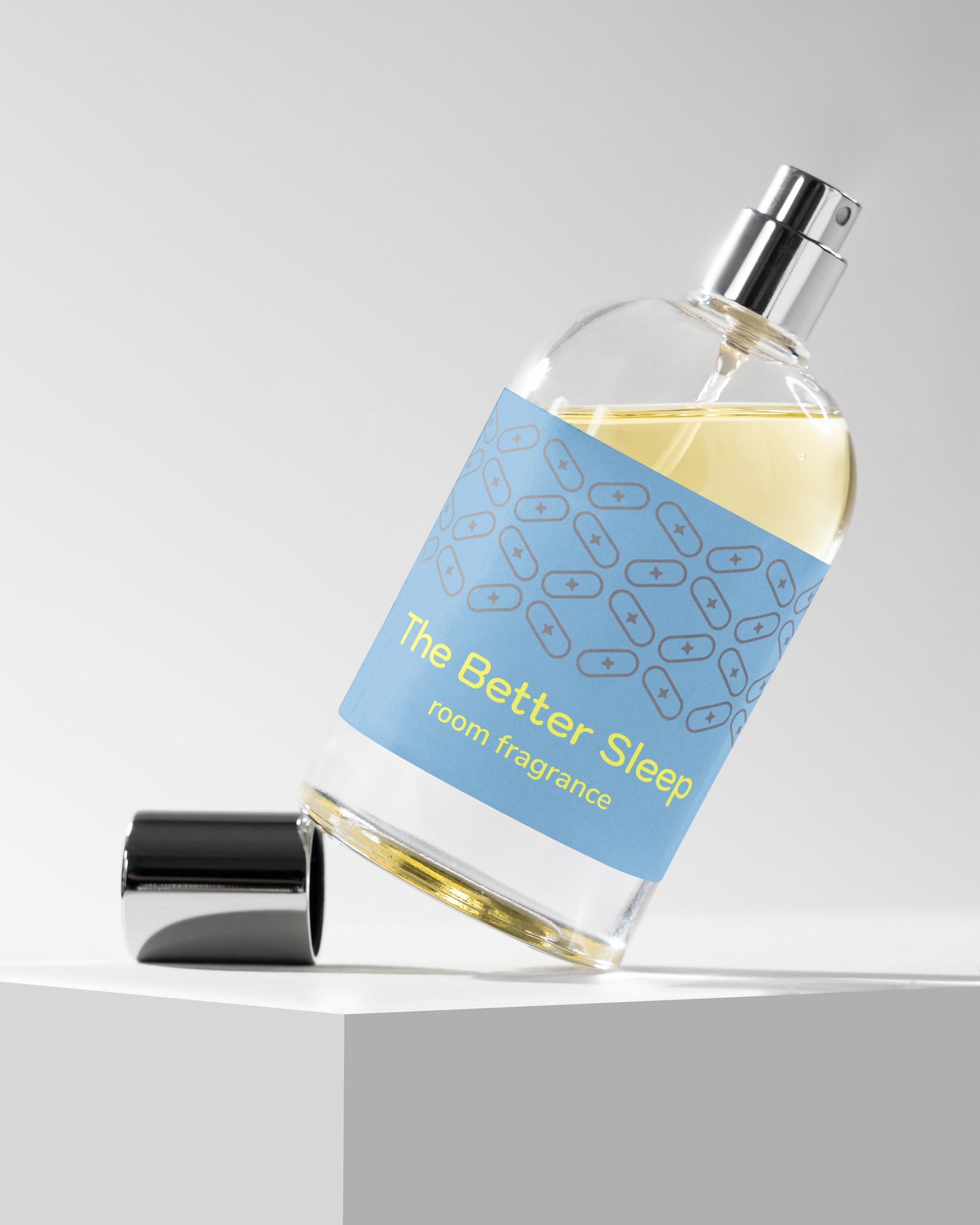
VIVI launched in Dubai with an idea as simple as it is relevant: regeneration should be possible where performance happens. That idea had to become a distinct brand – one that clearly moves sleep pods out of the wellness corner and makes them attractive to companies, modern workplaces and their users. The challenge was to position a new offering in a way that is easy to understand, to develop a fitting name, and to give it an identity that connects calm and regeneration with energy, performance and the forward-looking spirit of Dubai.
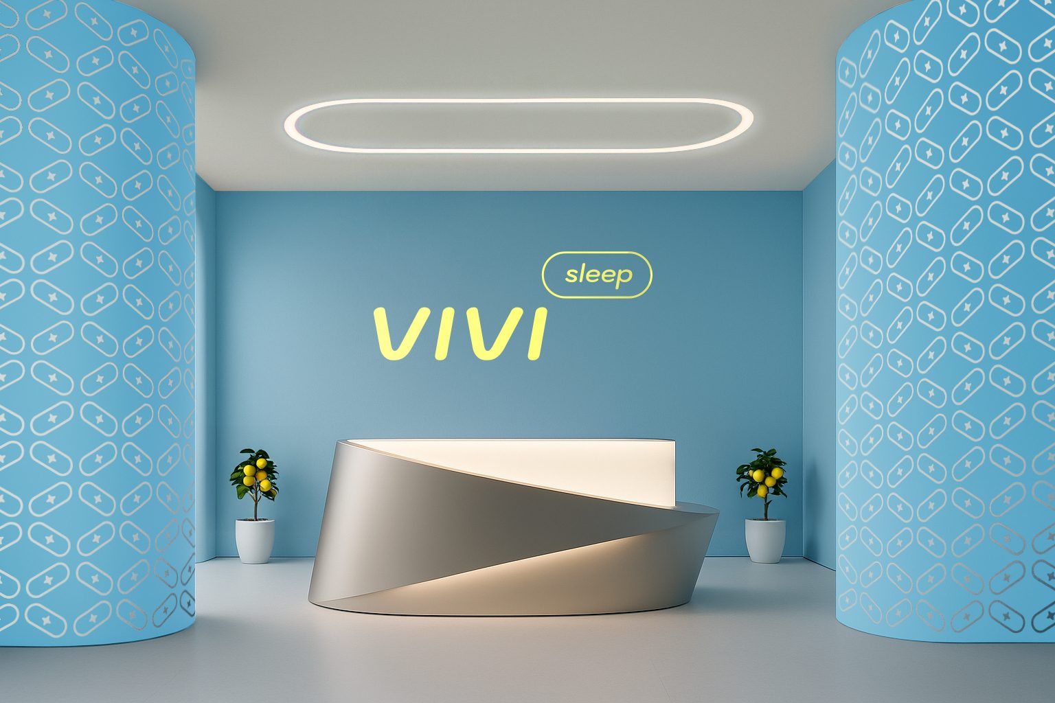
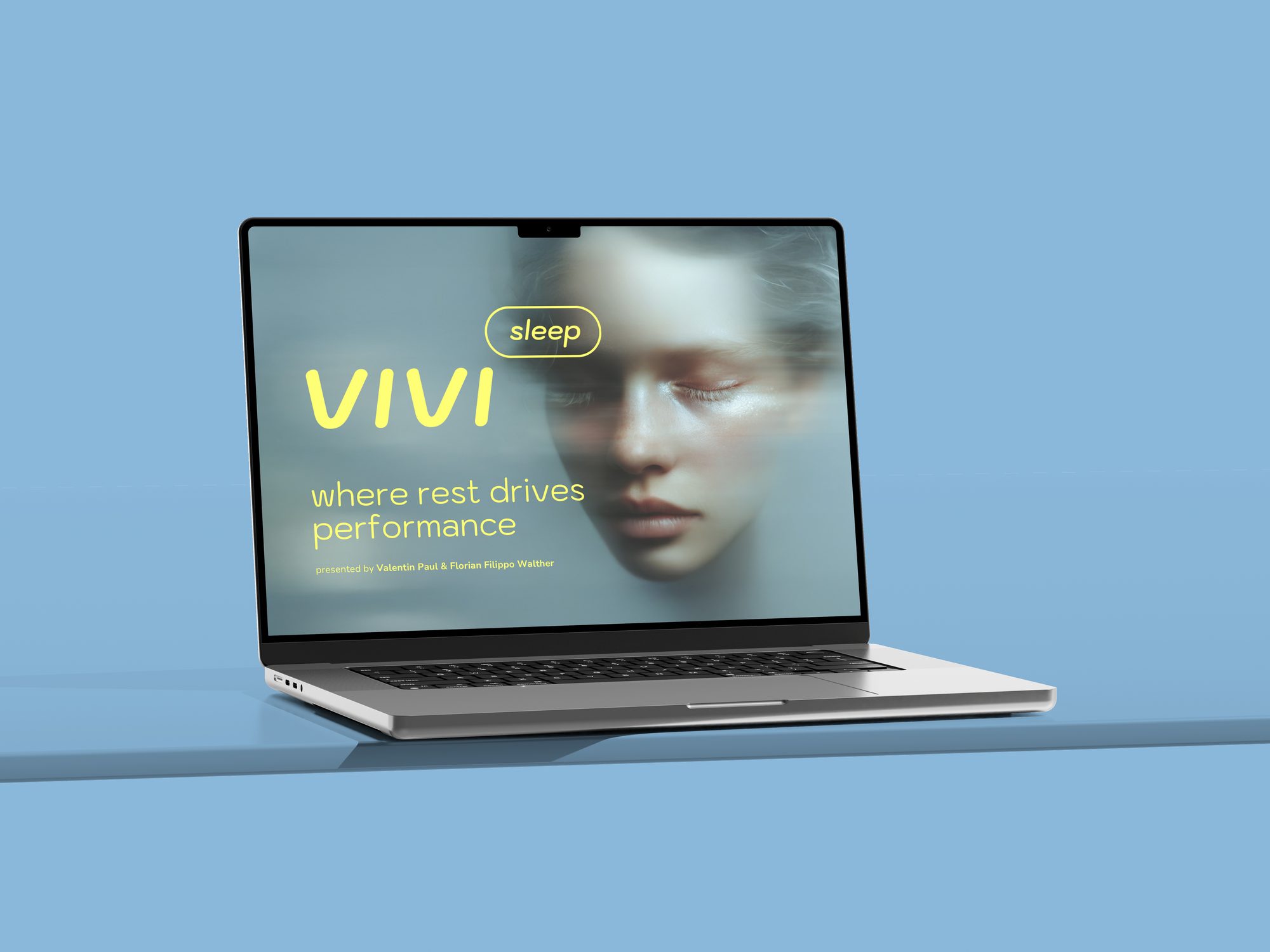
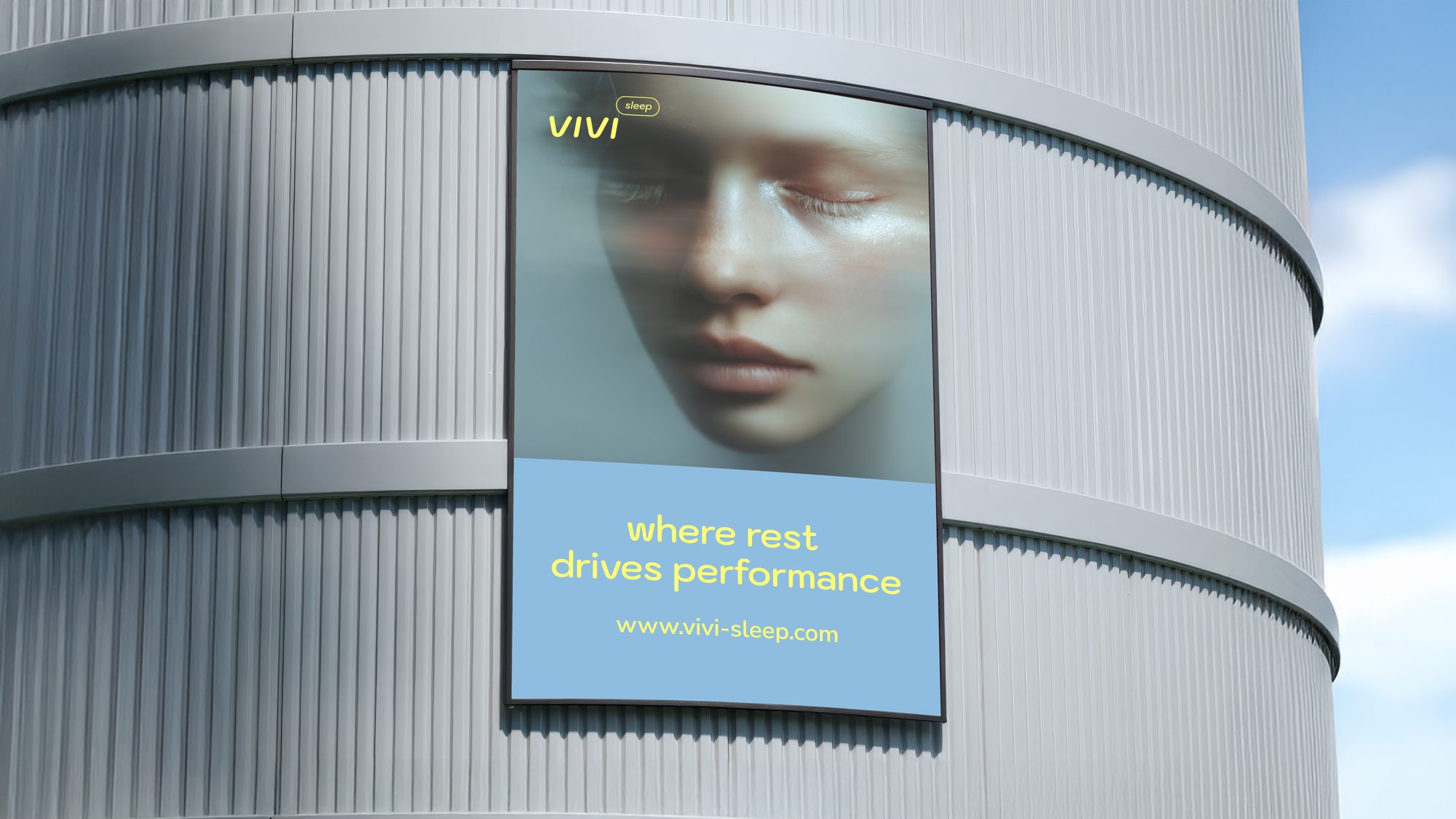
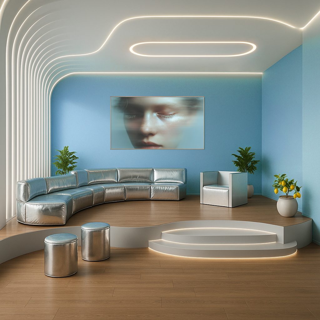
Together with VIVI we developed the positioning, naming and brand identity, and consistently translated the strategic idea into the corporate and product design of vivisleep. Under the guiding idea “Rest. Recharge. Redefine Performance.” a visual world emerged between regeneration and new energy. The minimalist, futuristic logo picks up the shape of the pods. Sky blue, energy yellow and Dubai silver combine calm, energy and the Dubai location. Even the brand pattern – developed from the logo, the pod shape and an energy impulse – draws on classical Arabic ornamentation and translates it into a modern, reduced form.
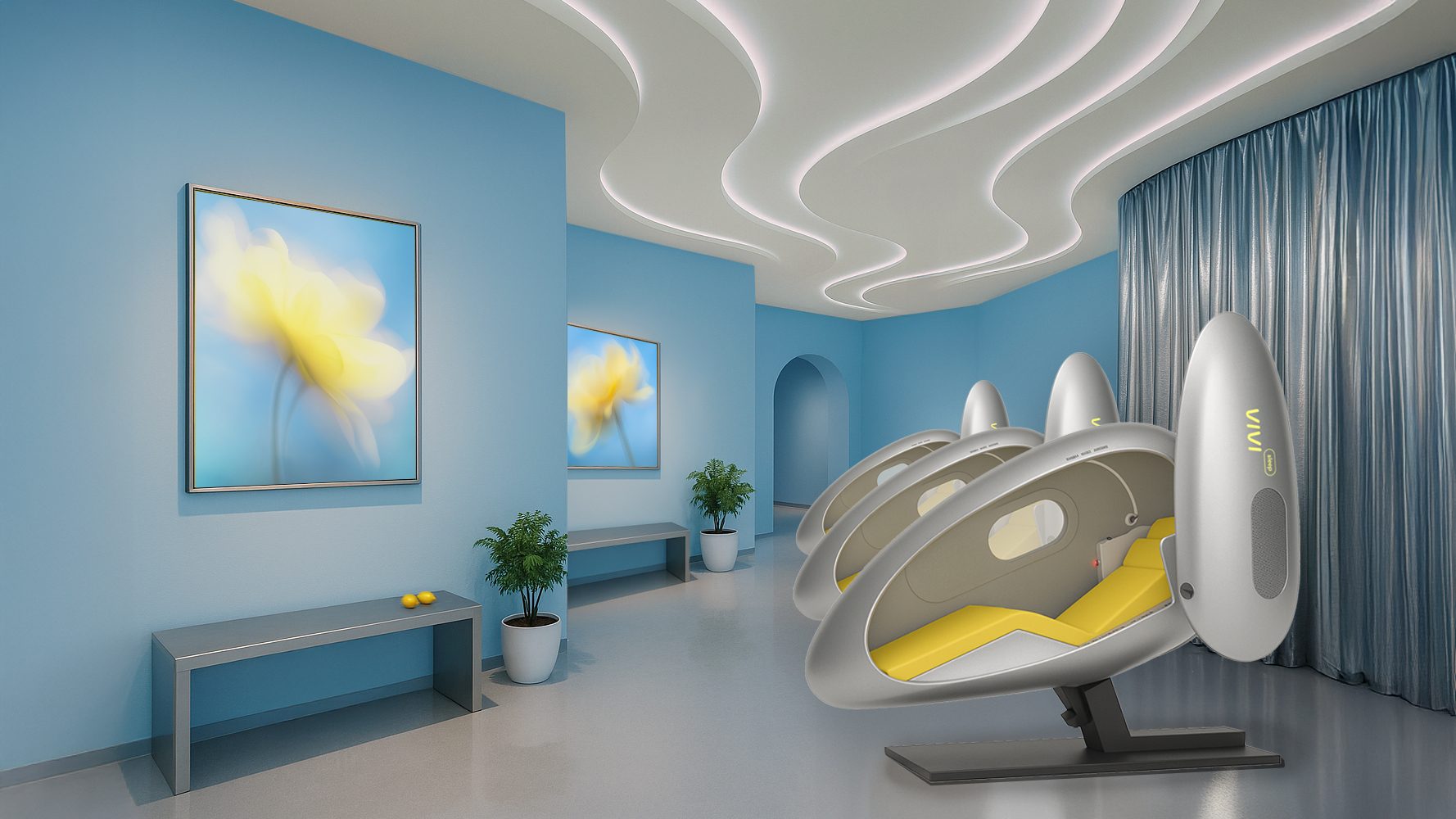




The result is a distinct brand in which strategy, communication and product come together as one consistent experience. The futuristic design of the pods continues across logo, colours, typography, imagery, digital applications and interior. The imagery visualises the moment between calm and renewed clarity, while energy yellow is used deliberately to activate. The corporate design thus becomes not only visible, but spatially and physically tangible. VIVI makes regeneration a visible part of modern performance.